How to Design Artwork for Custom Tissue Paper: A Practical Step-by-Step Guide
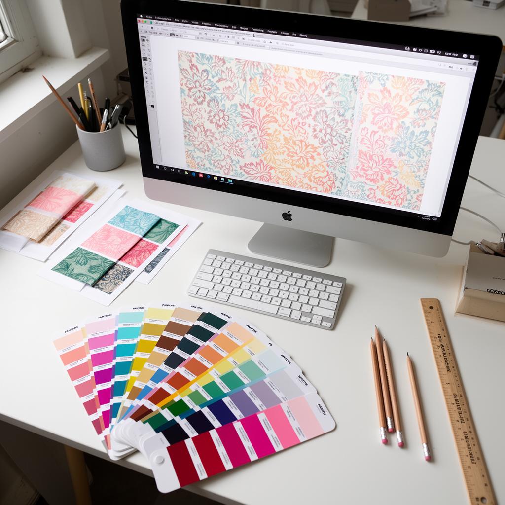
Getting good bespoke packaging often means thinking beyond the printed box. Custom tissue paper might seem like a small thing, but it really smartens up an unboxing, making your brand look better. To get it right, though, you need to understand how the artwork gets designed. Here at Big Tissue, we'll explain it all. This guide tells you what you need for good tissue paper artwork.
Your Canvas: What Tissue Paper Is Like
Before we get into design details, it's worth understanding tissue paper itself. It's thin and a bit see-through. These qualities change how your design will look. It's not like a solid cardboard box; tissue interacts with what it's wrapping. Its semi-transparent nature means colours can look different depending on what's underneath. We use good quality, FSC-certified tissue, so it's responsibly sourced. But even the best tissue feels and looks different to other printing materials.
Repeat Patterns: How Tissue Paper Designs Work
Most custom printed tissue paper uses a repeat pattern. This is mainly for practical reasons and for how it looks. Try to imagine lining up a big, single picture across a roll of paper – it would be really hard and a waste of material. Repeat patterns are made to tile perfectly, creating one continuous design no matter how the tissue is cut or folded.
There are a few types of repeat patterns:
- Block/Brick Repeat: This is the easiest and most common. Your design element (or 'motif') repeats next to itself, both across and down, like bricks in a wall. It's a straightforward pattern.
- Half-Drop Repeat: The motif in the second row is moved down by half the height of the one in the first row. This makes it look a bit more lively and less stiff than a block repeat. Think of staggered lines.
- Seamless Repeat: This is the main point of any repeat pattern. The edges of your design element need to line up perfectly when tiled. You shouldn't be able to see where one repeat finishes and the next starts. This makes it look smooth and professional.
When you're designing a repeat pattern, start with your single motif or 'tile'. This tile should contain everything you want to repeat. The important bit is to make sure elements that go to the edge of your tile connect smoothly when the tile is copied. Most graphic design programs have tools for making and checking seamless repeats. For Big Tissue, we usually work with repeat tile sizes that are easy to manage and print efficiently, often around 30cm x 30cm, but this is very flexible depending on your design.
Think about how big the repeat should be. A small, tightly packed repeat can create a dense, textured look. A larger, more spaced-out repeat might feel more open and simple. Consider the size of the products your tissue will wrap and how much of the pattern will actually show.
Colour: Spot Colour or CMYK?
Choosing your colour model is one of the most important decisions for tissue paper design. It affects the cost and what the final product looks like.
-
Spot Colour Printing (Pantone Matching System): We prefer this for custom tissue paper printing, and for good reason. Spot colours use pre-mixed inks. Each ink matches a specific colour from the Pantone Matching System (PMS). So if you pick a Pantone colour, say PMS 200 C (a certain red), that exact ink formula is used.
-
Good points:
- Consistent Colour: Very accurate colour. If your brand needs a specific Pantone red, spot colour printing makes sure that red is exactly the same every time, across all your printed items. That's key for brand recognition.
- Vibrancy and Opacity: Spot colours, especially solid ones, often look more vibrant and less see-through on tissue than CMYK colours. You'll particularly notice this with blues, greens, and darker shades.
- Cheaper for Simple Designs: For designs with one or two colours, spot colour printing can cost less than CMYK. It needs fewer printing plates and less complicated setup.
- Specialty Inks: Spot colour printing lets you use metallic, fluorescent, or opaque white inks. You can't do that with standard CMYK. Metallic and fluorescent inks are less common on tissue because it's absorbent, but opaque white on coloured tissue can look really good.
-
Bad points:
- Limited Colour Palette: You're stuck with the specific Pantone colours you choose.
- More Expensive for More Colours: Each extra spot colour needs a separate printing plate and ink run. This makes designs with lots of colours much more expensive.
-
-
CMYK Printing (Four-Colour Process): CMYK stands for Cyan, Magenta, Yellow, and Key (Black). This method makes a huge range of colours by layering tiny dots of these four main colours.
-
Good points:
- Full Colour: CMYK can reproduce almost any colour you can imagine. It's good for complex designs, photos, or gradients.
- Cheaper for Complex Designs: If your design has many colours, gradients, or photos, CMYK can be cheaper than using lots of spot colours.
-
Bad points:
- Less Predictable Colour on Tissue: Because tissue paper is see-through and absorbent, CMYK colours can look less vibrant. It's harder to control how saturated they are. The ink dots can also be more obvious, especially on lighter tissue.
- Inconsistent Colour: Getting exact colour matches with CMYK, especially for specific brand colours, can be hard. There's always a slight difference between print runs.
- Higher Minimums (sometimes): At Big Tissue, we do offer CMYK, but spot colour is what we do most for tissue. Our 250 MOQ often works out cheaper with spot colour.
-
Our Advice for Big Tissue: For the best results regarding colour consistency, vibrancy, and often cost (especially for 1-2 colour designs), we strongly recommend using spot colours (Pantone Matching System) for your artwork. If your brand has specific colours, find their corresponding Pantone Solid Coated (C) swatch numbers. This ensures we can match them exactly. If you're designing something with many colours or photographic detail, then CMYK is the way to go. Just remember colours might vary slightly on tissue.
Pantone Matching System (PMS)
The Pantone Matching System is a standard way to reproduce colours. Each colour has a unique number (e.g., Pantone 293 U for a particular blue, or Pantone 185 C for a bright red). When you give a Pantone number, it removes all guesswork. Both the printer (us) and the designer (you) know exactly which shade you mean.
- Coated (C) vs. Uncoated (U): When picking Pantone colours, you'll often see 'C' for coated paper and 'U' for uncoated paper. Tissue paper is an uncoated, absorbent material, so it’s best to reference Pantone Uncoated (U) swatches in your design software. This gives you a better idea of how the colour will look. The actual ink is the same, but the 'U' swatch in your software shows how it'll appear on a porous surface.
- Giving Pantone References: When you send your artwork, clearly state the Pantone Solid Uncoated numbers for each colour you want printed. This is non-negotiable for spot colour printing.
Required File Formats
The file format you use is important for keeping your artwork's quality. For Big Tissue, we need vector-based files as much as possible for spot colour printing.
-
Vector Files (.ai, .eps, .pdf, .svg): These are the gold standard for printing, especially for logos, text, and illustrations.
- Why they're needed: Vector graphics are made using maths. This means you can make them any size without losing quality or getting pixelated. This is crucial for repeat patterns where the design might be scaled or tiled many times.
- Best for Big Tissue: Adobe Illustrator (.ai) files are perfect. Make sure all fonts are converted to outlines ("create outlines" or "expand text") so they don't get replaced with the wrong font.
- Editable PDF (.pdf): A well-made PDF, saved from vector software with editing features kept, is also very good. Again, make sure fonts are outlined.
- .eps (Encapsulated PostScript): An older vector format, still widely accepted.
- .svg (Scalable Vector Graphics): Good for web, but less common for commercial print submissions than .ai or .pdf.
-
Raster Files (.jpg, .png, .tiff, .psd): These files are made of tiny squares called pixels.
- When they're okay: Raster files work for photos or very complex designs where vectorising isn't practical. But they must be high resolution.
- Resolution Needed: For tissue paper, we usually ask for 300 Dots Per Inch (DPI) at 100% print size. Lower resolutions will look fuzzy and pixelated.
- Limitations: Raster files aren't great for separating spot colours for logos or text. Getting crisp edges and consistent colour can be hard. If your design is mostly text or logos, it should be in vector format.
- Transparency: .png and .psd files can have transparent areas, which helps when layering things.
Basic Rule: If your design is a logo, text, or a graphic pattern, use vector. If it's a photo, use a high-resolution raster image.
Resolution: For a Clearer Picture
Resolution means how much detail an image has. It's measured in DPI (Dots Per Inch) for print or PPI (Pixels Per Inch) for screens.
- For Custom Tissue Paper: As before, aim for 300 DPI at the final print size.
- What this means: If your repeat tile is, say, 30cm x 30cm, any raster images within that tile should be 300 DPI when seen at that 30cm x 30cm size.
- Why it matters: Low-resolution images (like 72 DPI, common for web photos) will look blurry, pixelated, and unprofessional when printed. You can't just increase the DPI of a low-res image without it still looking blurry; it needs to start high-resolution.
Bleed Area: Edge-to-Edge Printing
Bleed is a key printing term. It makes sure your design goes right to the edge of the finished product without any annoying white borders.
- What it is: Bleed is the part of your artwork that extends past the cut line of the printed piece. When we cut the tissue paper, there's always a tiny bit of movement. If your colour or design stops exactly at the edge, any small shift could leave a visible white sliver.
- How much bleed?: For custom printed tissue paper, we usually suggest a minimum of 3mm bleed around your repeat tile. So, if your repeat tile is 30cm x 30cm, your artwork file should technically be 30.6cm x 30.6cm, with the outer 3mm on each side being the bleed area.
- Why it's important for repeats: For repeat patterns, the bleed needs to be a continuation of the pattern. Make sure elements that run off one edge of your repeat tile also run off the matching edge of the bleed area. This keeps the pattern looking seamless.
- Don't put important bits in the bleed area: Keep logos, text, or any crucial design elements at least 5mm away from the trim edge. This stops them from being accidentally cut off.
Common Design Mistakes
Even experienced designers can make these mistakes when getting tissue paper artwork ready:
- Low-Resolution Raster Images: This is the biggest cause of poor print quality. Always check your DPI.
- Not Outlining Fonts: If you don't turn text into paths/outlines, our computer might use a different font, making your design look completely wrong.
- Missing or Wrong Bleed: This leads to white edges where there shouldn't be any, or cut-off design elements.
- Wrong Colour Mode (e.g., RGB for Print): RGB (Red, Green, Blue) is for screens. Printing needs CMYK or Spot Colours. Designing in RGB and converting at the end can cause unexpected colour changes. Always design in the print colour mode you'll use from the start.
- Too Complex Designs for Tissue: Tissue can handle detail, but extremely thin lines or very tiny gaps can sometimes 'fill in' or look less sharp. Ink spreads a bit on absorbent paper. Make intricate elements clear enough.
- Forgetting Tissue is See-Through: Colours will look a bit different on tissue than on opaque paper. Think about this when picking colours, especially if printing on coloured tissue. The base colour will subtly affect the printed ink.
- Not Doing the Repeat Right: If your repeat pattern isn't designed properly, you'll see jarring breaks when it tiles.
- Not Saving to the Correct File Format: Sending a low-res JPG when a vector EPS was available. Always provide the best file type you have.
- No Pantone References: If you want spot colours, you must give us the Pantone Solid Uncoated codes. "That blue on our website" isn't enough for an exact match.
- Tiny Text or Thin Lines: Tissue is delicate. Very small text or extremely thin lines can become hard to read or get lost in printing. Aim for text at least 8pt for readability, and lines at least 0.5pt thick.
Doing It Yourself or Hiring a Designer
This is a common question, especially for smaller businesses.
-
DIY Design:
- Pros: Cheaper, you have full control, faster if you know what you're doing.
- Cons: Needs knowledge of graphic design software (Adobe Illustrator is highly recommended), understanding of print requirements (like this guide!), and attention to detail. Mistakes here can mean costly reprints.
- When it works: If you have design experience, the right software, and a clear idea for a fairly simple pattern.
-
Hiring a Professional Designer:
- Pros: They know print design, ensure brand consistency, handle all the technical bits, produce high-quality, neat results, and can bring new creative ideas.
- Cons: Costs more, you need to clearly explain your ideas.
- When it works: If you don't have design software/skills, have a complex design, need strict brand rules followed, or just want a guaranteed professional outcome without the hassle.
- Big Tissue's Role: We don't do full design work, but we're always happy to advise you and check your artwork for print readiness. If a lot of design work is needed, we'll suggest getting a professional.
Proofing Your Artwork: Your Final Check
Once your artwork is ready and sent to us, we'll send you a digital proof for approval. This is your very last chance to spot any errors before we print.
-
What to check on the proof:
- Layout: Is everything where it should be?
- Spelling and Grammar: Read all text carefully.
- Colours: Do the colours (especially Pantones) look right to you? (Remember: colours on a screen will always look a bit different from print, but the Pantone codes should be correct).
- Scale: Does the repeat pattern size look right?
- Seamless Repeat: Make sure there are no visible breaks in the pattern.
- Registration: Check for any misalignment if you have multiple colours.
- Bleed and Safe Areas: Confirm no important elements are too close to the edge.
-
Why it matters: Once you approve the proof, we start printing. Any mistakes found after approval will mean reprinting costs, which no one wants! Take your time, show it to colleagues, and be absolutely sure before you give the final "go ahead."
In Short: Key Things for Big Tissue Printing
- Repeat Patterns: Design patterns that tile smoothly, either block or half-drop.
- Spot Colour is Best (mostly): Use Pantone Solid Uncoated for accurate, vibrant colours; give us the specific PMS codes. CMYK for full-colour images.
- Vector Files: Use .ai, .eps, or .pdf for logos, text, and patterns. Outline all fonts.
- Resolution: 300 DPI at actual print size for any raster elements.
- Bleed: At least 3mm bleed that extends your pattern. Keep important elements 5mm away from the edge.
- Proof Carefully: Your final check is crucial.
Follow these points, and you'll get great, professionally printed custom tissue paper that truly helps your brand. At Big Tissue, with our FSC-certified paper, 250 MOQ, and 7-day turnaround, we're ready to get it done for you. Do ask if you have any questions during your design process – we're here to help you get it right.
Once your artwork is ready, upload it to our product builder to see how it looks on tissue paper before you order. If you're using Adobe Illustrator, Adobe's Illustrator tools are industry standard for creating print-ready vector artwork.