Pantone Colour Matching for Tissue Paper: Getting Your Brand Colours Right
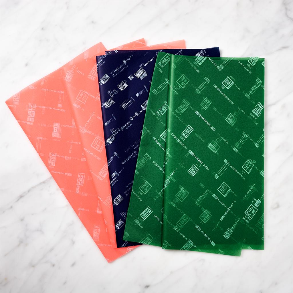
Your brand colours are one of the most recognisable elements of your business identity. When customers see your signature shade, they should immediately think of your brand. That is why colour accuracy matters so much when printing custom tissue paper.
Pantone colour matching is the gold standard for ensuring your tissue paper is printed in exactly the right colours. This guide explains how it works, why it matters, and how to get the best results.
What Is the Pantone Matching System?
The Pantone Matching System (PMS) is a standardised colour reproduction system used across the printing and design industries worldwide. Each colour is assigned a unique reference number, ensuring that a colour printed in London looks identical to the same colour printed in Manchester, New York, or Tokyo.
When you specify a Pantone colour for your tissue paper, you are giving the printer an exact colour formula to follow, eliminating guesswork and ensuring consistency across every batch.
Why Pantone Matching Matters for Tissue Paper
Brand Consistency
Your tissue paper is part of your brand experience. If the shade of blue on your tissue paper does not match the blue on your website, business cards, and shopping bags, it creates a subtle but noticeable inconsistency that undermines brand trust.
Customer Expectations
Regular customers develop a relationship with your packaging. They expect the same beautiful tissue paper every time they order. Pantone matching ensures that reorders are identical to the original print run.
Professional Appearance
Accurate colour reproduction signals professionalism. It tells customers that you care about every detail of their experience, right down to the shade of your tissue paper.
How Pantone Colour Matching Works
Step 1: Identify Your Pantone Colours
If you already have brand guidelines, your Pantone colours should be listed there. Common places to find your Pantone references include:
- Brand guidelines document
- Logo files and specifications
- Previous print supplier documentation
- Your graphic designer's files
If you do not know your Pantone colours, do not worry. We can help you identify the closest Pantone match to your existing branding by comparing samples from the Pantone colour book.
Step 2: Coated vs Uncoated
Pantone colours come in two versions:
- Coated (C): How the colour looks on glossy, coated paper
- Uncoated (U): How the colour looks on uncoated, matte paper
Since tissue paper is uncoated, you should specify the Uncoated (U) version of your Pantone colour. For example, Pantone 186 U rather than Pantone 186 C.
The same Pantone number can look noticeably different on coated versus uncoated paper, so this distinction is important.
Step 3: Providing Your Colours to the Printer
When placing your order, provide your Pantone references in one of these ways:
- Include them in your artwork file
- List them in your order notes
- Reference them in your email or enquiry
For example: "Please print in Pantone 286 U (blue) and Pantone 186 U (red)."
Step 4: Proof Approval
Before your tissue paper goes to print, you will receive a digital proof showing the layout and colours. While screen colours are never 100% accurate (every monitor displays colours differently), the Pantone references ensure the physical print will be correct.
Spot Colour vs CMYK: Understanding the Difference
Spot Colour Printing
Spot colour printing uses pre-mixed Pantone inks. Each colour is mixed to the exact Pantone formula before printing. This method delivers the most accurate colour reproduction and is ideal for:
- Logos and branding elements
- Designs using 1-4 colours
- When exact colour matching is critical
Our 17gsm tissue paper is perfectly suited to spot colour printing, typically with 1-2 colours.
CMYK Printing
CMYK (Cyan, Magenta, Yellow, Key/Black) printing creates colours by combining these four inks in different proportions. It is used for:
- Full-colour photographic designs
- Complex multi-colour artwork
- Gradient effects
Our 30gsm tissue paper is ideal for CMYK printing, delivering photographic-quality results.
Important note: CMYK printing can closely approximate Pantone colours but may not achieve an exact match. If colour accuracy is critical, spot colour printing is the better choice.
Common Colour Challenges and Solutions
My Colours Look Different on Screen
This is completely normal. Every screen has different settings for brightness, contrast, and colour temperature. Trust your Pantone reference numbers rather than what you see on screen.
The Print Looks Different from My Business Card
Different substrates (materials) absorb ink differently. Tissue paper is more absorbent than card stock, so colours may appear slightly softer or warmer. This is a natural characteristic of the material and is factored into the printing process.
I Need an Exact Match to My Existing Packaging
Send us a physical sample of the colour you need to match. Our print team can use a spectrophotometer to identify the closest Pantone match and ensure consistency.
My Brand Uses a Custom Colour
If your brand colour does not correspond to a standard Pantone reference, we can create a custom ink mix. This may require a slightly larger minimum order, but it ensures your tissue paper is a perfect match.
Tips for Best Colour Results on Tissue Paper
- Always specify Uncoated (U) Pantone references for tissue paper
- Request a printed sample before committing to a large order
- Keep your artwork simple — bold, clean designs reproduce best on tissue
- Consider the tissue base colour — white tissue gives the truest colour reproduction
- Use high-contrast designs — they look more impactful and are more forgiving of minor variations
- Store colour references — keep a record of exact Pantone numbers for future reorders
Our Colour Range
We offer a huge range of tissue paper base colours, from classic white to vibrant brights and elegant metallics. You can also opt for flood-printed tissue, where the entire sheet is printed in a solid colour.
Browse our colour guide to see the full range of options available, or get in touch and we will help you find the perfect combination for your brand.
Get Your Colours Right
Ready to order custom tissue paper in your exact brand colours? Send us your Pantone references and artwork, and we will create a free proof showing exactly how your tissue paper will look. Our expert print team is always happy to advise on colour choices and printing methods.
To learn more about how Pantone matching works on tissue paper, see our colours guide for a full breakdown of spot colour vs CMYK options. Pantone themselves have a useful colour finder tool if you need to look up specific references.