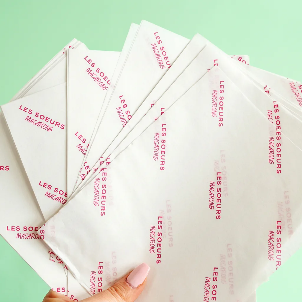
Which colour option suits your design?
| Your design | Starting point | What to check |
|---|---|---|
| One solid logo on white | One spot colour | Supply the Pantone reference if you have one. |
| Logo plus a separate accent | Two spot colours | Check whether the colours touch or overlap. |
| Multicolour illustration or gradient | CMYK | Expect some bright screen colours to look less vivid. |
| Coloured background with white logo | Flood print with unprinted logo areas | White comes from the base paper; check fine lettering. |
| White ink on black or dyed tissue | Bespoke enquiry | Confirm stock, ink opacity and availability before ordering. |
| Metallic, fluorescent or foil finish | Bespoke enquiry | A CMYK gold colour is a flat colour, not a metallic finish. |
Count distinct printed inks, not the number of objects in the pattern. Fifty repetitions of the same navy logo still use one spot colour. A navy logo plus a pink motif uses two. White gaps on white paper do not add a white ink.
How to specify a Pantone colour
Send the full reference from your brand guidelines, including its suffix, and tell us which colour is most important. A coated reference ends in C; an uncoated reference ends in U. These describe the reference paper surface. They should not be swapped without discussing the intended appearance.
The paper affects how an ink looks. Pantone explains that coated and uncoated paper can give the same colour a different appearance. Tissue is also much thinner than a typical swatch-book sheet, so a Pantone reference is a target for discussion rather than a promise of identical appearance on every material.
- Attach your brand guide or list the complete colour references.
- Identify a physical item you want the tissue to sit alongside, such as a bag, label or box.
- State whether that item or the Pantone reference should take priority if they differ.
- If the match is critical, ask what physical colour-checking options are available before committing to production.
For reorders, keep an approved sheet away from sunlight and record its order reference. A photograph of an old sheet can show the pattern, but lighting and camera processing make it a poor colour standard.
RGB, HEX and CMYK: why screens differ from print
RGB and HEX values describe screen colours. CMYK describes combinations of cyan, magenta, yellow and black inks. A colour that looks bright on a backlit phone may fall outside what those inks can reproduce on tissue.
If your only reference is a website HEX code, send it with your original logo and explain that no print reference exists. We can discuss a suitable route. Converting the number in a design app does not by itself create a reliable physical match.
CMYK can reproduce many colours, but it does not make every Pantone shade, fluorescent effect or metallic finish. Ask your designer to flag any brand colours that are likely to change when converted.
White tissue, coloured stock and flood backgrounds
White tissue with a printed pattern
This keeps much of the paper unprinted. It gives a logo room to stand out and lets you use a single ink for a recognisable repeat. Consider how the paper’s translucency changes the design over dark products.
A printed background on white tissue
A flood print covers a large area with ink. If a white logo is left out of that background, the white paper forms the logo: printers call this a knockout or reverse. The sheet’s back and cut edge may reveal the white base; printing a surface does not dye the fibres all the way through.
Dyed or black tissue
Coloured stock and a flood print can look different in folds and on the reverse. The standard builder uses white stock. For dyed paper, opaque white ink or a particular finish, send a bespoke enquiry so we can confirm the available combination.
Read the white ink and coloured tissue guide if your artwork depends on a white logo against a dark background.
Make the logo readable after wrapping
A subtle design on a flat sheet may disappear when it is folded around a product. Test the pattern at its actual logo size, then fold it so you see only the area that will remain visible. Pale text, fine strokes and similar background colours need particular attention.
- Use enough contrast for the smallest lettering to remain legible.
- Leave space between repeats so folds do not turn the design into a dense block.
- Check tissue over both a light and dark backing if you sell products in different colours.
- For a seasonal design, retain a recognisable logo colour rather than changing every element at once.
A sample pack helps you compare paper feel and existing print examples. It contains past production samples, so it is not a physical proof of your own colours.
What to check on your colour proof
The digital proof is primarily a check of artwork, dimensions, repeat spacing and colour instructions. It cannot show the precise effect of lighting, ink absorption or translucency on the finished sheet.
- Confirm the correct logo version, including any reversed white areas.
- Check that each colour reference is labelled and that the background is included.
- Confirm whether the design is spot colour or CMYK; do not assume a Pantone name means a separate ink is being used.
- Resolve colour-critical questions before approving production.
Typical turnaround is seven working days from artwork approval. Allow time before that for colour discussions and any revisions, especially when coordinating tissue with packaging from another supplier.
Common questions
Can you match my brand colour exactly?
Supply a complete Pantone reference or a physical sample as the target. Paper, ink and lighting affect the result, so an exact match across different materials cannot be assumed. Discuss any critical match before artwork approval.
Does a white logo need white ink?
On white tissue with a printed background, the logo can be left unprinted so the paper shows through. A white logo on dyed or black tissue needs a different production approach and should be quoted separately.
Is gold in a CMYK design metallic?
No. A gold-coloured CMYK design is a flat printed colour. Metallic ink and foil are separate finishes; ask about availability and suitability before including them in your specification.
Can I use a HEX code instead of Pantone?
You can send a HEX code as a starting reference, together with your logo. It describes a screen colour and does not guarantee a printed match. Tell us if you have a physical packaging item that the tissue needs to coordinate with.
Continue planning your packaging
Prepare your artwork
Files, repeat patterns, resolution and production proofs.
Compare paper weights
Understand feel and show-through before choosing a stock.
Plan a logo repeat
Choose spacing and scale for a pattern that works folded.
Complete buying guide
Bring colour, size, weight and quantity into one specification.