White Ink on Coloured Tissue Paper: Print Guide
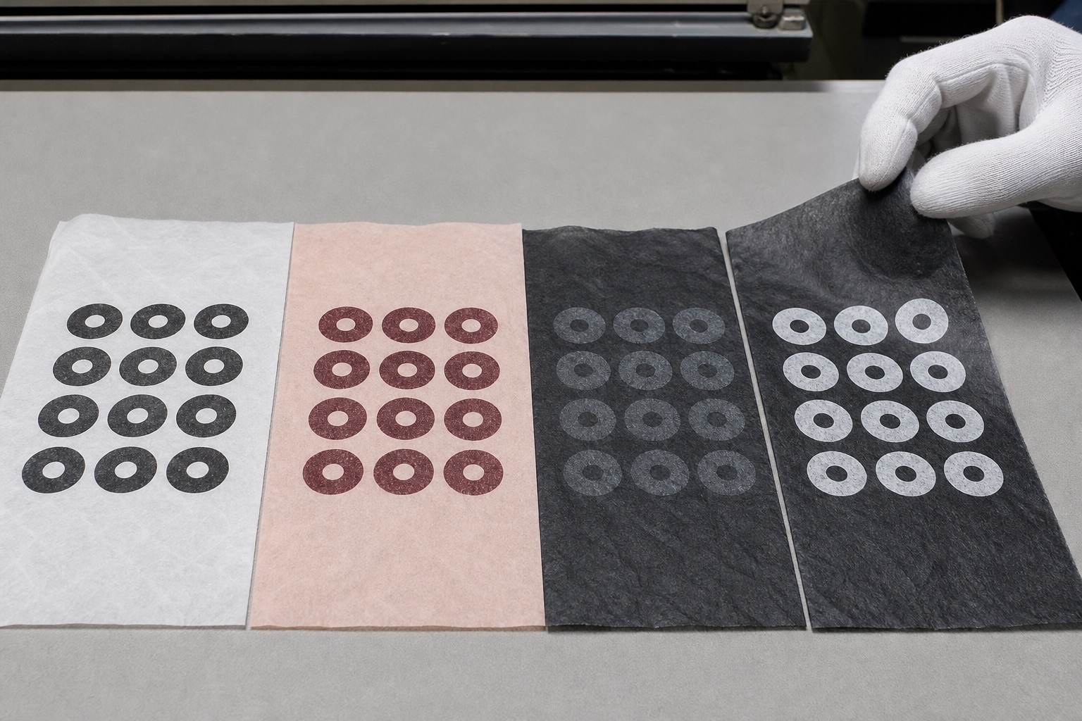
White ink on dark tissue can look excellent, but it rarely behaves like white vinyl, white paint or a bright white image on a screen.
Tissue paper is thin, absorbent and often translucent. Ink interacts with the paper colour beneath it. A white logo printed on black tissue may appear soft grey, chalky or deliberately understated rather than brilliant white. That is not automatically a fault; it is the physical result of ink, paper and print method.
The right question is not “Can you print white?” It is:
How opaque does the white need to be, on which tissue, using which process, and what variation is acceptable?
This guide helps you specify a result that can actually be produced.
Why white ink is different
Most colour printing assumes a white base. Standard CMYK inks are translucent: cyan, magenta, yellow and black combine visually because light reflects from the white paper beneath them.
On coloured tissue, there is no white base. Pale inks lose contrast and the paper colour influences the result.
White is also not part of standard CMYK. It requires a separate white ink or a process specifically capable of laying white down. The opacity depends on:
- Ink formulation.
- Ink film thickness.
- Number of passes or impressions.
- Paper colour.
- Paper absorbency.
- Surface finish.
- Logo shape.
- Print method.
- Production tolerances.
A digital mock-up showing pure screen white on deep black paper is not a reliable production prediction.
What white ink looks like on black tissue
There are three broad visual outcomes:
Soft translucent white
The logo appears grey-white and allows some black paper tone through. It can feel quiet, modern and tactile.
This works well when the brand accepts subtlety. It does not work when brand rules demand a brilliant white match.
Stronger opaque white
More pigment or additional ink laydown creates higher contrast. The result may still be less bright than white paper because tissue fibres, absorption and background influence remain.
Higher opacity can affect:
- Drying.
- Fine detail.
- Rub resistance.
- Cost.
- Production method.
White created by leaving paper unprinted
On white tissue with a dark flood background, the white logo can be the unprinted paper showing through. This may create a cleaner white than printing white on pre-coloured paper, but it is a very different job with much greater ink coverage.
Flood printing requires careful discussion about coverage, registration, paper behaviour and cost. It should not be ordered from a mock-up alone.
White tissue with dark ink is the safest high-contrast option
If the goal is simply a crisp monochrome brand, dark ink on white tissue is usually:
- More predictable.
- More economical.
- Easier to colour match.
- Better for fine detail.
- Higher contrast.
- Simpler to repeat consistently.
This is why many premium brands choose black, navy, burgundy or a Pantone spot colour on white paper. The result can feel more refined than a technically difficult white-on-dark treatment.
Choose white-on-dark because the dark sheet is important to the packaging concept, not because it sounds inherently more luxurious.
How paper colour changes printed ink
Tissue colour acts like an underlayer.
Pale blush and pastel tissue
Dark inks normally retain good contrast. White ink may be almost invisible or create only a subtle tonal change.
Kraft or natural tissue
Black and dark brown print clearly. White may appear warm cream because the natural base shows through. Pale brand colours can become muted.
Red, green and blue tissue
Dark print can lose contrast on deep colours. White ink may pick up the visual character of the base and appear tinted. Complementary ink choices can behave differently from a screen proof.
Black and charcoal tissue
White, metallic and very pale inks offer the most visible contrast, but opacity must be sampled. Black ink on charcoal can create a sophisticated near-tone effect if intentional.
The printed result is a combination of ink colour and substrate colour, not two independent swatches.
Screen colour is not tissue colour
Screens emit light. Printed tissue reflects it.
An RGB colour selected from a website may not have a direct Pantone or print equivalent. Tissue adds more variables:
- It is thinner than coated packaging board.
- Fibres break up solid edges.
- It changes appearance when folded.
- Products beneath it influence perceived colour.
- Two stacked sheets appear darker or more opaque than one.
- Warm and cool lighting change the result.
Use digital proofs to confirm layout, scale and approximate colour relationships. Use physical samples or press proofs where exact appearance is critical.
Spot colour versus CMYK on tissue
Spot colour
A spot ink is mixed as a single colour. It is often the most predictable route for:
- One-colour logos.
- Pantone-led brand colours.
- Repeating marks.
- Strong dark print on white tissue.
- Simple white or metallic effects where the process supports them.
CMYK
CMYK combines four process colours and suits:
- Photographic artwork.
- Gradients.
- Multi-colour illustrations.
- Designs where several colours must appear together.
CMYK on translucent tissue will not match coated paper exactly. Fine details and pale tones may soften. If white is needed beneath a CMYK image, ask whether a white underprint is possible and how it affects cost and detail.
Our spot colour versus CMYK guide explains the broader choice.
Logo details that affect white printing
White ink rewards robust artwork.
Very fine lines
Thin strokes can fill, break or appear weak. Increase line weight for tissue rather than sending artwork optimised for a screen.
Tiny reversed text
Small counters inside letters may close. A tissue print should not be expected to reproduce microtype like a label.
Large solid areas
They make variation, pinholes and paper texture more visible. A repeat of smaller marks is often more forgiving.
Gradients and transparency
A white spot ink is usually treated as a defined print colour, not a screen transparency effect. Discuss any tint or gradient before artwork approval.
Closely spaced repeats
Dense white coverage can alter both look and cost. It also makes small shifts more noticeable.
Create a simplified production version of the logo if necessary. Protecting legibility is more important than reproducing every detail.
How to build a useful white-ink proof
A good proof should show:
- Exact sheet size.
- Logo dimensions.
- Repeat spacing.
- Pattern angle.
- Print side.
- Intended paper colour.
- Named ink treatment.
- Areas of expected show-through.
Ask whether the proof is:
- A layout proof.
- A colour simulation.
- A physical printed proof.
Those are not the same. A PDF can accurately show a 45-degree repeat but cannot prove ink opacity on real black tissue.
Ask for samples with comparable coverage
A random white-ink sample is useful only if it resembles your proposed job.
Compare:
- Similar paper colour.
- Similar paper weight.
- Similar logo stroke width.
- Similar solid area.
- Similar print process.
- Similar opacity target.
A bold 30mm circle can print successfully while a delicate 6pt wordmark fails on the same material.
If the exact treatment matters, a paid physical proof or short trial may be sensible. Confirm what is commercially available for the quantity.
White ink and paper weight
Heavier tissue is often more opaque, which can make the printed result feel more substantial. It does not automatically make white ink brighter.
Weight affects:
- Show-through from the product.
- Paper handling.
- Fold sharpness.
- Ink absorption.
- Perceived colour when layered.
Test the intended combination. A logo approved on 30gsm should not be assumed identical on 17gsm.
Use the tissue paper GSM guide to select the base stock according to the product, not only the ink.
White ink versus metallic ink
Metallic ink contains reflective pigment and creates a different effect from opaque white.
On dark tissue:
- Silver may appear brighter than white under directional light.
- Gold can provide strong contrast but changes with viewing angle.
- Fine metallic detail may soften.
- The result is an ink effect, not foil stamping.
If the brief says “luxury white”, do not substitute silver without approval. If the goal is simply contrast on black, ask to see both.
Read our metallic and foil-effect tissue guide.
White-on-white printing
White ink on white tissue creates a tonal effect through changes in opacity, texture and reflectance. It can be elegant, but it is intentionally low contrast.
It works best when:
- The logo is reasonably bold.
- Lighting will reveal the difference.
- The brand accepts subtle variation.
- The tissue is part of a close, tactile unboxing.
It performs poorly when:
- The logo must be obvious in photographs.
- The pattern contains delicate text.
- The customer expects bright contrast.
- The tissue is seen only briefly from a distance.
Ask for a physical example. Screen mock-ups usually exaggerate the effect.
Can white ink rub or crack?
Any ink system has performance limits. Tissue flexes, folds and rubs against products. Dense or high-opacity ink areas may show fold marks more readily than light coverage.
Test:
- Rub two printed areas together.
- Fold through the heaviest printed region.
- Wrap the actual product.
- Leave it under realistic box pressure.
- Inspect the product for transfer.
If the tissue touches pale, porous or valuable surfaces, contact testing is essential.
A decision framework
Choose dark ink on white tissue when:
- Crisp detail and predictability matter most.
- Budget is tight.
- The logo has fine elements.
- High contrast is required.
Choose white ink on dark tissue when:
- The dark base is central to the brand.
- A softer white is acceptable.
- Artwork is bold.
- Physical samples have been approved.
Choose a dark flood on white tissue leaving the logo unprinted when:
- A white logo must be the paper itself.
- Dense coverage is technically and commercially suitable.
- The brand accepts the cost and production constraints.
Choose CMYK on white tissue when:
- The design genuinely requires multiple colours or imagery.
- Exact solid brand colour is less important than the complete image.
Common ordering mistakes
Asking for “bright white” without defining it
Use a physical reference and accept that different materials cannot always match.
Approving only a PDF
PDFs confirm artwork, not substrate interaction.
Supplying a fine screen logo
Prepare artwork for absorbent tissue.
Ignoring the product beneath
Translucent tissue changes over dark and light contents.
Comparing different paper weights
Opacity and print appearance shift with stock.
Treating metallic ink as foil
They are visually and technically different.
Assuming more ink is always better
Higher opacity may sacrifice fine detail or flexibility.
How to brief the printer clearly
Replace subjective words such as “bold”, “premium” and “bright” with production information.
Send:
- The exact tissue colour and weight.
- Vector logo artwork.
- The intended logo size.
- A photograph or physical reference for the desired contrast.
- Whether soft show-through is acceptable.
- Which details must remain legible.
- The product that will sit beneath the tissue.
- The expected quantity.
Ask the printer to state whether the proposed white is a single pass, multiple pass, spot ink or another method, and whether the supplied proof demonstrates layout only or physical opacity.
If colour is business-critical, keep the approved printed sample. Use it when reviewing the production run and future reorders. A verbal request for “the same white as last time” is weaker than a named job reference and retained sample.
Frequently asked questions
Can you print white ink on black tissue paper?
Yes, using a suitable white-ink process. Expect the result to be influenced by the black base and tissue texture. Approve a comparable physical sample if bright opacity matters.
Will white ink look pure white?
Not necessarily. It may look soft grey-white or slightly tinted by the paper. Process, coverage and paper all affect the result.
What colour prints best on white tissue?
Dark spot colours such as black, navy, deep green and burgundy usually produce strong, predictable contrast. The exact choice should follow brand and supplier guidance.
Is white ink part of CMYK?
No. Standard CMYK has cyan, magenta, yellow and black. White requires a separate ink or underprint capability.
Can I print a pale logo on kraft tissue?
Possibly, but expect the kraft tone to warm and mute it. Dark ink is more predictable. Request a comparable sample.
Is white-on-white tissue visible?
Yes, but intentionally subtle. Visibility comes from surface and opacity differences, not strong colour contrast.
The practical recommendation
Start with the contrast you truly need. If a crisp logo is the priority, dark ink on white tissue is the reliable benchmark. If a dark sheet is essential, simplify the artwork and approve a physical white-ink example with comparable paper and coverage.
Do not let a perfect on-screen mock-up become an impossible print standard.
For a straightforward one-colour job, build and price the tissue online. For white, metallic, flood or other specialist treatments, request a production-led quote and describe the opacity you expect.