How to Design a Repeating Logo Pattern for Tissue Paper
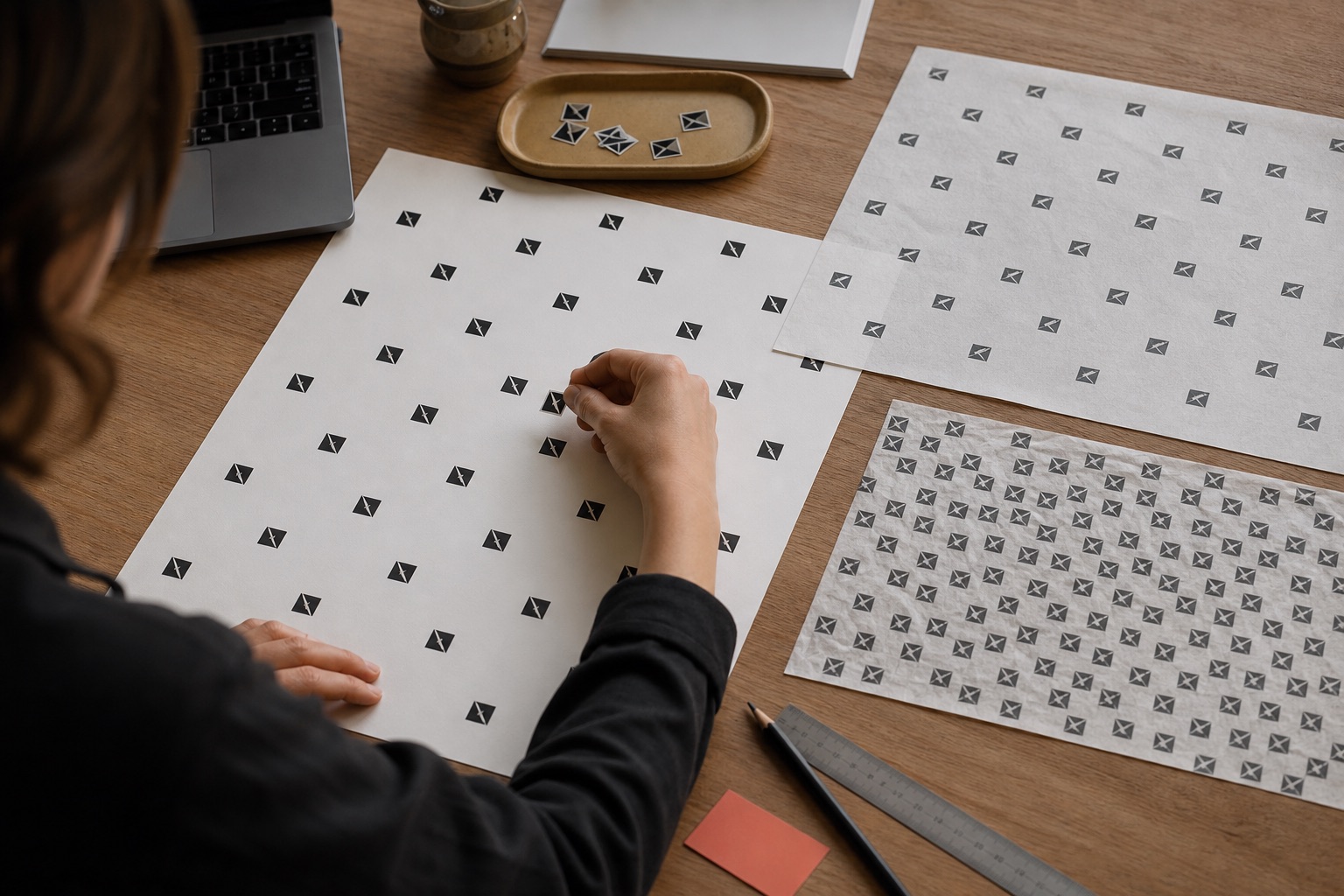
A repeating logo pattern looks simple because the finished result is simple. Producing a good one requires decisions about scale, spacing, direction, contrast and what happens when a large sheet is folded around a small product.
The strongest repeats do not try to show the maximum possible number of logos. They create a recognisable rhythm that survives cutting, wrapping, gathering and partial visibility.
This guide gives you a production-minded method for building the artwork, even if the final file is prepared by your designer or supplier.
Begin with how the tissue is used
Artwork should follow the packing method.
Ask:
- Is the product fully wrapped?
- Is tissue used as a box liner?
- Is it gathered in a retail bag?
- Will the sheet be cut into smaller pieces?
- Which area appears first when the box opens?
- How large is the product compared with the sheet?
A pattern designed for a flat 700 × 1000mm sheet may disappear into folds around a ring box. A repeat made for jewellery can look frantic on a garment wrap.
Pack a blank sheet first and mark the areas that remain visible. Those areas tell you more than a full-screen mock-up.
Use the correct logo file
Vector artwork is the safest starting point.
Common vector formats include:
- AI.
- EPS.
- SVG.
- A PDF that contains genuine vector paths.
PNG and JPEG files are pixel-based. They can work when resolution is sufficient, but scaling them up can soften edges. A logo copied from a website or social profile is rarely a good production master.
Check that:
- Fonts are outlined or supplied.
- Thin lines are printable.
- Colours are clearly defined.
- Hidden objects and clipping masks are removed where possible.
- The mark works in one colour if that is the chosen process.
Our wider print-ready tissue artwork guide covers file preparation in more detail.
Simplify before repeating
A mark that reads clearly at 80mm may fail at 20mm.
Create a small-use version if the logo contains:
- A long strapline.
- Fine hairlines.
- Tiny registered marks.
- Detailed illustration.
- Several close colours.
- Small counters inside letters.
The reduced version might use the symbol without the wordmark, remove a strapline or strengthen fine lines. This is normal brand production, not a compromise in quality.
Print the proposed logo at actual size on office paper. View it from arm's length and fold it. If important detail disappears before printing on tissue, enlarge or simplify it.
Choose the logo size
There is no universal ideal. Useful starting ranges are:
- 15–25mm: small jewellery and cosmetics tissue.
- 25–45mm: general ecommerce and retail repeat.
- 45–70mm: clothing, larger boxes and a quieter premium look.
- 70mm and above: bold statements where only part of the mark may be seen.
These are design starting points, not press limits.
Small logos create more repetitions and a busier surface. Large logos create confidence and space, but a small product may show only part of one.
Test three sizes on the same sheet. Wrap the real product and compare the opening view, not just the flat artwork.
Set clear space around each mark
Clear space allows the logo to remain distinct after fibres, ink spread and folds soften the image.
A practical starting point is clear space equal to half the logo's height on every side. A 30mm-high mark would begin with approximately 15mm between its edge and the next mark.
That may still be too tight for a long wordmark or too generous for a compact symbol. Assess visual rhythm.
Avoid measuring only centre-to-centre spacing. Two logos can share the same centre distance but feel very different if one is much wider.
Straight repeat versus diagonal repeat
Straight grid
Rows and columns align horizontally and vertically.
Advantages:
- Orderly and graphic.
- Easy to construct.
- Works with geometric brands.
Risks:
- Small alignment variation is noticeable.
- Folds can create unintended stripes.
- It may feel rigid.
Half-drop repeat
Each row shifts by half the spacing.
Advantages:
- Balanced without looking like a spreadsheet.
- Distributes marks evenly.
- Hides small production variation.
Risks:
- Needs careful tile construction.
- Direction may emerge if spacing is uneven.
Diagonal repeat
Marks follow a repeated diagonal, commonly around 30 or 45 degrees.
Advantages:
- Dynamic.
- Survives wrapping well.
- Familiar for branded tissue.
Risks:
- Directional logos can appear sideways.
- Large angles create empty bands.
Random repeat
Marks rotate or vary in position within rules.
Advantages:
- Organic and playful.
- Hides strict registration.
Risks:
- True randomness looks accidental.
- Rotated wordmarks can be hard to read.
- Clusters and empty holes require manual control.
“Random” patterns need more design judgement, not less.
Build one seamless repeat tile
The production file should repeat without visible edges.
For a simple tile:
- Create a rectangle at the intended repeat dimensions.
- Place the logo with exact coordinates.
- Duplicate any object crossing the left edge at the same vertical position on the right.
- Duplicate objects crossing the top edge at the same horizontal position on the bottom.
- Test the tile in a larger field.
- Look for lines, clusters and empty channels.
Do not leave clipped objects at only one edge. The repeated field will show a break.
If your supplier imposes a repeat cylinder, plate or print-area requirement, obtain the template before finalising the tile.
Consider the print method
One-colour spot printing is ideal for simple repeat logos. It gives the artwork a single clear colour and usually handles robust vector marks well.
Two-colour repeats require registration between inks. Avoid tiny gaps and hairline traps unless the print process can hold them.
CMYK supports multi-colour artwork, gradients and images but can be unnecessary for a logo that has a good monochrome version. Tissue texture and translucency soften process printing compared with coated paper.
Read spot colour versus CMYK before building several colours into the repeat.
Choose colour for contrast
Dark ink on white tissue is the predictable benchmark.
When printing on coloured tissue:
- Dark ink needs enough contrast with the base.
- Pale ink may become tinted by the paper.
- White ink on dark tissue may appear softer than screen white.
- Two stacked sheets appear different from one.
Use our white ink on coloured tissue guide when a reverse or pale logo is planned.
Do not judge colour from an RGB screen alone. Define a Pantone or production colour where appropriate and approve comparable samples.
Plan for cutting
If a 500 × 700mm sheet will be cut into smaller sheets, the repeat should remain balanced in each cut section.
Ask:
- What are the final cut dimensions?
- Is the large sheet divided evenly?
- Will a cut run through important marks?
- Does every smaller sheet contain enough complete logos?
- Does pattern direction remain useful?
A repeat can look excellent on the parent sheet and leave a small cut sheet containing only fragments.
Create outlines for the intended cuts during design, then remove or place them on a non-printing layer before output.
Design for folds, not only flat sheets
Print a full-size paper proof if possible, then:
- Place the actual product.
- Complete the approved fold.
- Mark visible surfaces.
- Photograph the reveal.
- Open the tissue and inspect which logos were hidden or split.
You do not need every logo to remain complete. Cropped marks create natural pattern. The goal is that enough recognisable branding appears at each stage.
If the final sticker always covers the strongest logo, change the repeat offset or sticker position.
Avoid the “logo wallpaper” problem
Too many small marks can feel cheap, particularly with a long wordmark.
Signs of overcrowding:
- Several logos appear inside one small fold.
- Negative space disappears.
- The pattern competes with the product.
- Fine print turns into visual noise.
- The brand becomes less recognisable, not more.
Try increasing both logo size and spacing. Fewer, clearer marks often feel more premium.
The opposite problem is under-branding. If a jewellery sheet can be folded without revealing any complete mark, reduce spacing or use a smaller symbol.
Create a controlled random pattern
If a natural layout suits the brand:
- Choose two or three permitted rotations.
- Define a minimum distance between marks.
- Keep logo size consistent, or use only two planned sizes.
- Prevent overlapping.
- Check clusters at all tile edges.
- Repeat the tile and inspect from a distance.
Do not rotate readable wordmarks upside down unless the identity deliberately allows it. A symbol tolerates rotation more easily than text.
Add secondary motifs carefully
A repeat can include:
- Logo symbol.
- Simple brand shape.
- Small product icon.
- Seasonal motif.
- Short word or phrase.
Limit the visual vocabulary. Each extra element adds colour, spacing and legibility decisions.
For evergreen stock, avoid:
- Dates.
- Limited offers.
- Web addresses likely to change.
- Product names used only by part of the range.
- Seasonal artwork on a quantity that will outlast the season.
Timeless tissue is safer to reorder and easier to use across products.
Proof at actual scale
An A4 proof that shrinks an entire 500 × 700mm sheet hides problems.
Request or create:
- A full-sheet layout view.
- A 100% scale crop.
- Logo dimensions.
- Centre-to-centre or edge spacing.
- Repeat angle.
- Named print colour.
- Final sheet size.
Measure the 100% crop with a ruler. Confirm that the artwork has not been “fit to page” by a printer setting.
Minimum line and text size
Exact limits depend on paper and process. Ask the printer rather than copying a rule from labels or business cards.
As general discipline:
- Avoid hairlines.
- Strengthen small reversed detail.
- Remove tiny legal text from a repeat.
- Keep counters open.
- Use robust shapes.
If a detail is essential, make it larger. If it is not essential, remove it.
Create a production handover
Include:
- Vector master artwork.
- Colour reference.
- Sheet dimensions.
- Logo size.
- Repeat tile dimensions.
- Pattern angle.
- Print side.
- Cut plan.
- A visual mock-up.
- Notes about any acceptable rotation.
Name files clearly. “final-final-v7-new.pdf” creates avoidable risk.
Keep the approved proof with the purchase order and retain it for reorders. If artwork changes, create a new version rather than overwriting the approved master.
Common repeat-pattern mistakes
Making the logo too small
Fine detail fills and the mark vanishes in folds.
Using equal spacing without looking at rhythm
Measurements can be correct while the pattern feels uneven.
Forgetting tile edges
Seams become visible across the printed sheet.
Designing on a white rectangle only
Coloured and translucent tissue changes contrast.
Ignoring cuts
Small finished sheets receive awkward fragments.
Approving a reduced proof
Actual logo size is never checked.
Adding too many brand elements
The surface becomes a catalogue rather than a pattern.
Treating a digital mock-up as a colour proof
Layout may be accurate while ink appearance is not.
Frequently asked questions
What size should a logo be on tissue paper?
For many general retail repeats, 25–45mm is a useful starting range. Small jewellery sheets may use 15–25mm, while clothing and large boxes can support 45–70mm. Test the real fold.
How far apart should repeated logos be?
Begin with clear space around half the logo height, then adjust for the mark and product. Judge edge-to-edge space as well as centre distance.
Should tissue logos be straight or diagonal?
Diagonal and half-drop repeats are forgiving during wrapping. Straight grids feel more ordered but make alignment more obvious. Follow the brand and packing method.
Can I use a PNG logo?
A high-resolution transparent PNG may work, but vector artwork is preferable for clean scaling and spot-colour separation.
Should every logo be fully visible?
No. Cropping is natural on folded tissue. Make sure several complete recognisable marks appear across the sheet and likely reveal areas.
Can you create the pattern from my logo?
Yes. Supply the best available vector file and tell the production team the product, sheet size and preferred density. A proof should be approved before printing.
The practical recommendation
Start with one robust logo mark, one print colour and generous clear space. Build a seamless half-drop or diagonal repeat, proof it at actual size and wrap the real product before approving it.
The best tissue pattern is not the one that looks busiest on a flat screen. It is the one that still feels deliberate after a packer folds it and a customer opens it.
When your logo is ready, upload it to the tissue builder for a live preview, or ask the production team to prepare the repeat.